|
|
|
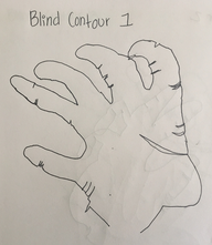
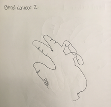
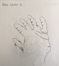
Blind contour hand drawings:
For my blind contour hand drawings I was not able to look at what I was drawing. I had to move the pencil on the paper imagining that the pencil point is actually the hand. I decided to start from the bottom of my hand adding every detail I saw.
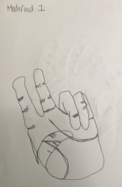
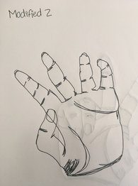
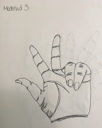
Modified hand drawings:
|
|
|
For my modified hand drawings I was able to glance and look at my paper. Since I could see what I was drawing I was able to add even more details making it look realistic.
Backpack drawing:
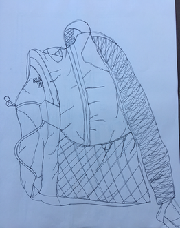
For my backpack drawing I first started from the bottom as well. Trying to use a fluid line throughout the whole backpack and adding all the texture I was able to see.
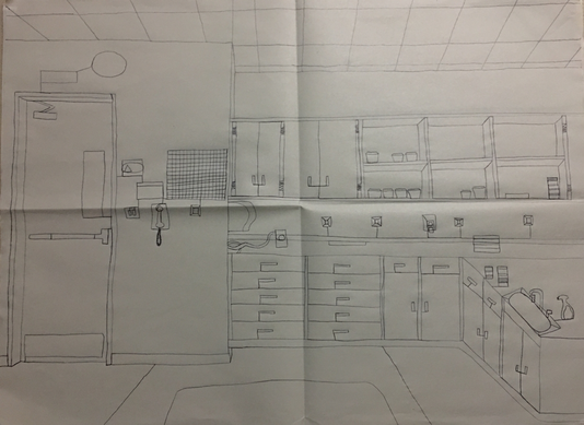
Room drawing:
Practice-
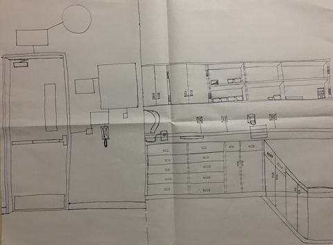
For my practice room drawing I tried to get all of my porportions right making it look realistic. I also tried to add as much detail of the room as I could.
Final-
Drawing Critique Questions
1. Did you use a fluid line? Explain how is this evident?
Answer:
For my room drawings I did try really hard to make sure my line was fluid trying not to pick up my pencil. As I drew my picture I also tried to make it as realistic as I could. This is evident because usually when you stop and continue you see a line with an end and it is very helpful because it allows you to actually focus on how the object looks.
2. Explain how your knowledge and creating practice studies with contour line contributed to the success of your piece.
Answer:
I really think the practice studies we did actually helped me a lot in contributing to do my final. On the first time try I made a lot of mistakes but they would be getting better each time. I have always thought that practice makes perfection, thats why it is important to practice drawing.
3. Describe the difference in your contour line drawing to an outline drawing.
Answer:
An outline drawing is very different from an contour line drawing. An outline is the edge of a shape or figure depicted by an actual line drawn or painted on the surface. While contour is the perceived line that makes the border of an object in space.
4. Explain how your interpretation of line is essential in capturing the look of the room.
Answer:
For me line is essential in capturing the look of a room because it is what makes your room look realistic and adds detail. Line is an element of art used to define shape, contours, and outlines; also to suggest mass and volume. It may be a continuous mark but it is used to add detail on your drawings.
5. What did you learn from completing this drawing? If you could recreate your piece what would you do differently to enhance the final outcome?
Answer:
What I learned from completing this drawing is that the more you practice the better you get at drawing. I also learned that it is very important to actually focus on what you are drawing adding all types of details you see and not just on how it may look on paper.
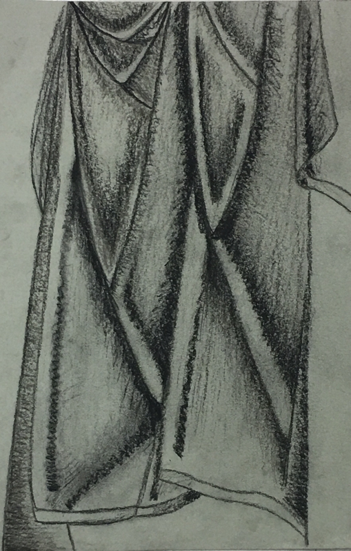
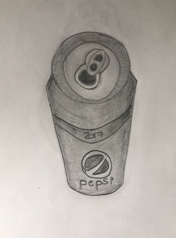
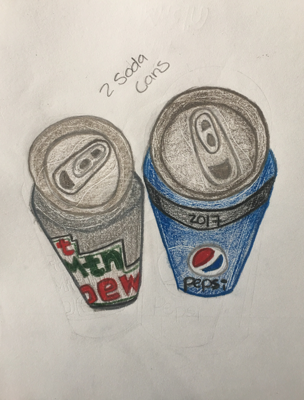
Value Chart & Form
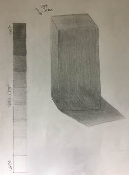
Value is the lightness or darkness of tones or colors. White is the lightest value and black is the darkest. The value halfway between these extremes is called middle gray. For my form drawing I made sure to highlight where the light was being reflected and to darken where there was no light.
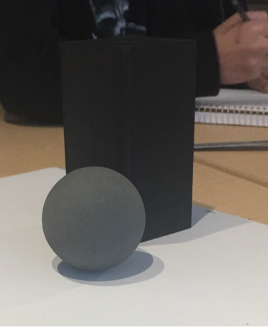
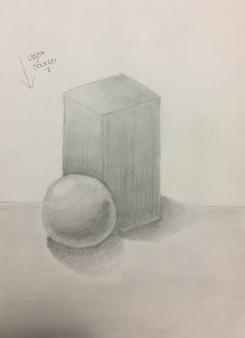
Mini Still Life
|
|
For my mini still life I had to arrrange both of my forms in a way they would overlap each other. So I decided to place the sphere in the front and leave the rectangular prism in the back. I used value to make the forms look more realistic as well as adding the shadow of the objects being reflected on the table.
White Ribbon
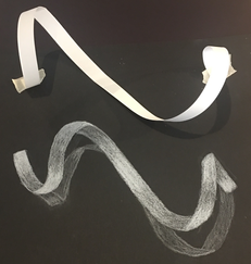
For my white ribbon drawing I made sure to highlight more with white where the light was being reflected on the ribbon and also included the shadow created on the table.
White Value Chart & Practice
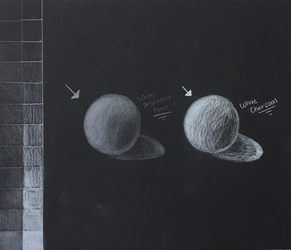
In this drawing we created a value chart for both the white prismacolor pencil and the white charcoal. We also practiced using these medias by creating a sphere drawing for each.
Fabric Drawing
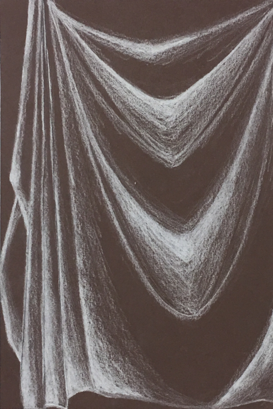
Above are my practice fabric drawings using three different types of media. On my first drawing I used the white charcoal on brown paper and then I used black charcoal on gray paper. On my last fabric drawing I used the white prismacolor on black paper, I really enjoyed working with the prismacolor because it was easier for me to blend making the fabric look smoother. After creating these mini drawings we had to make our final fabric project on a bigger construction paper.
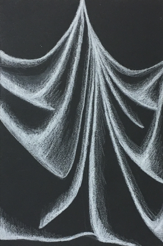
Final Fabric Drawing

Fabric Drawing Critique Questions
1. Did you use a wide range of values? (A range from white to black with at least 9 values). Explain how is this evident?
Answer:
I think my fabric drawing shows a wide range of values from white to black. I tired my hardest to try to show the nine different values and decided to use the prismacolor pencil on black paper for my final drawing. This is evident in my drawing by the way I highlighted at the tips of the fabric where the light was being reflected and got darker towards the valleys.
2. Explain how your knowledge and creating practice studies with value contributed to your piece.
Answer:
Practicing with fabric before creating my final project helped me a lot and it was easier for me to see where the highlights and shadows could be in the drawing. The mini practices also allowed us to try the three different types of media we could choose from and see which one worked the best for us. On my first practice drawing I had difficulty seeing where the lights and darks lined up and all the different shapes in the fabric. As I progressed in my drawings I got better every time making the fabric look more detailed and more realistic.
3. Describe the blending and transitions in your fabric (discuss your use of pressure with pencil/colored pencil/charcoal pencil and other techniques to achieve this).
Answer:
On the tips of the fabric where the light was reflected the most I made the lines lighter therefore adding more pressure. During my transitions from the lights to the darks my pressure gets lighter and lighter making the color lighter as well. To blend my fabric I used a blending stump allowing me to make the fabric look realistic and smoother.
4. Explain how your interpretation of texture is essential in capturing the look of the object.
Answer:
Texture is the feel, appearance, or consistency of a surface or a substance. Texture is very important in drawing because it defines they way you shade. In this specific fabric drawing their was no texture the fabric was smooth therefore I just added all the creases and folds created in the fabric. On textured fabric the pencil lines would define its texture.
5. If you could recreate your pieces what would you do differently to enhance the final outcome?
Answer:
If I could recreate my piece I would try to use more ranges of value from the lights to the darks. I would also try to blend a little better because on some folds my transitions were not as smooth. Overall I really liked my final fabric drawing and enjoyed trying the three different types of media.
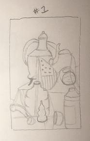
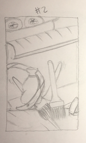
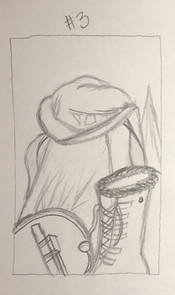
Still Life Drawings
Compositional Sketches:
|
|
|
Before we started our project we had to choose three different sections from the still life. We drew an easy sketch for the three sections to see which one would be the best to draw. After I finished I decided to do my first sketch because it had more detailed items and I really wanted to draw the flag as the center of interest.
Final (In Progress):
Still Life Critique Questions
1. Describe the craftsmanship of your drawing. (Is it clear, clean edges, blended well, smudges, defined space, etc.)
Answer:
I believe the craftsmanship of my drawing is blended well but it also contains many smudges throughout the drawing. Since I tried to add details my hand will constantly rub against my paper making the smudges. If I were to do it again I would try to be more careful and blend everything better.
2. Are your values and shadows realistic? How many values did you include? How and why are values important?
Answer:
The values and shadows of my drawing are realistic because by looking at the real still life it was easier for me to see where the highlights and the shadows where on the objects. Looking at my drawing I think I used about 5 different values because I could of used lighter values on the highlights and used a darker value on the shadows. Value is very important because it creates the crisp edges between all the different shapes and objects.
3. Is there a clear source of lighting?
Answer:
In my drawing there is not a clear source of lighting. The light was shinning down from two angles, one from the top left and one that was almost straight above the objects. It was difficult for me to see where the light was coming from since their are so many lights in the classroom.
4. How important were the compositional sketches? Explain.
Answer:
I think the compsitional sketches were very important and helpful in completing my final drawing. The compositional sketches helped me decide which section of the still life would be the best for me to draw. They also helped me get the proportions right and it was easier for me to draw my final piece with less mistakes.
5. How is your final drawing successful?
Answer:
I think my final drawing is successful because I added a lot of details on the objects and made sure to show the highlights and shadows. I also really liked how the glass bottle and vase turned out because I made sure to highlight the areas the lights was being reflected from. I am very pleased with the outcome of my project and hope to do another one.
6. Are the proportions, structure and perspective of the subject correct?
Answer:
As I was drawing my final piece I was trying not to look at the picture in my phone as reference. I would actually look at the still life in front to me to make sure I got my proportions correct and to make it look more realistic. The set up of my still life is pretty accurate on how big everything is and what objects look like in front of each other. The only object I would say is a little off is the the glass bottle because it looks the same size as the paint bottle but it was supposed to be a little taller.
7. Does the placement & grouping of objects create a pleasing arrangement (composition)?
Answer:
The composition of my drawing is not too crowded but it has a good amount of objects in it. I also made sure to include some negative space in the background but not too much. I think the flag centers my piece and the objects on the sides balance out my drawing. Overall I think my composition is pleasing to the eye but it is not the best.
8. Is there a center of interest and is it well located?
Answer:
I think the center of interest is the flag and the glass bottle almost directly in the center of my drawing. The flag sort of stands out when you look at the drawing. While the glass bottle underneath the flag stands out because of the highlights I added where the light was being reflected.
9. How well did you manage your time and resources throughout the process of creating this drawing? Do you see where you could improve in this area?
Answer:
I think I managed my time quite well, I started by making an outline of how everything would look like at first. Then I came back and added all the value to my piece and lastly I added the small details and all the shadows. I could of improved more in adding more lighter and darker values to have more of a contrast between my objects.
10. What challenges did you encounter during this project and how did you overcome them?
Answer:
The most challenging part of this project was drawing the glass bottle and the little vase. I had a difficult time trying to figure out the right way to highlight the glass and how to draw the shape of it. I decided to use very light pressure on the pencil when I went over the glass and then I came back with an eraser to create the highlights,
11. What have you learned drawing a still life?
Answer:
I learned to exaggerate shadows to create depth and also to make sure the objects in front or behind don't blend together. I also learned that it is very important to use a wide variety of values to add contrast between the objects. These still life drawing helped me learn many different things and I really enjoyed doing it.
Prismacolor Practice
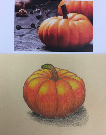
|
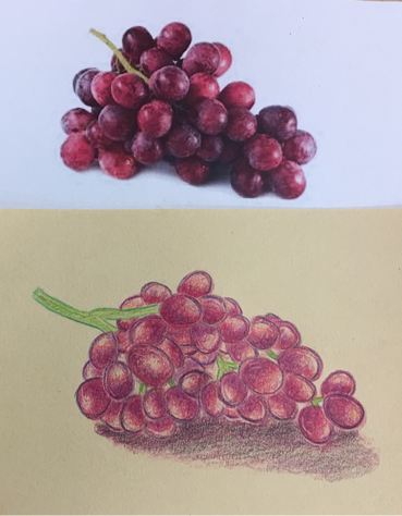
|
To practice using prismacolors since it was my first time, we drew a pumpkin and a grape drawing. We practiced blending prismacolor shades together and using contrasting colors to emphasize the highlights and shadows.
Prismacolor Glass Drawing
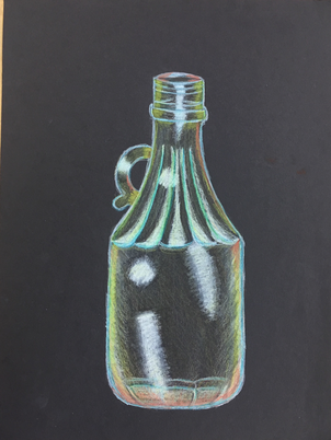
This is my practice drawing on how to draw glass with prismacolors. The glass was placed in a box with the background full of many different color paper which reflected on the glass. I used a variety of colors on the glass and used the white prismacolor to highlight the areas where the light was being reflected.
Foreshortening Drawing
Sketches:
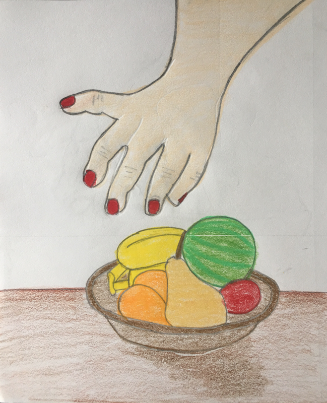
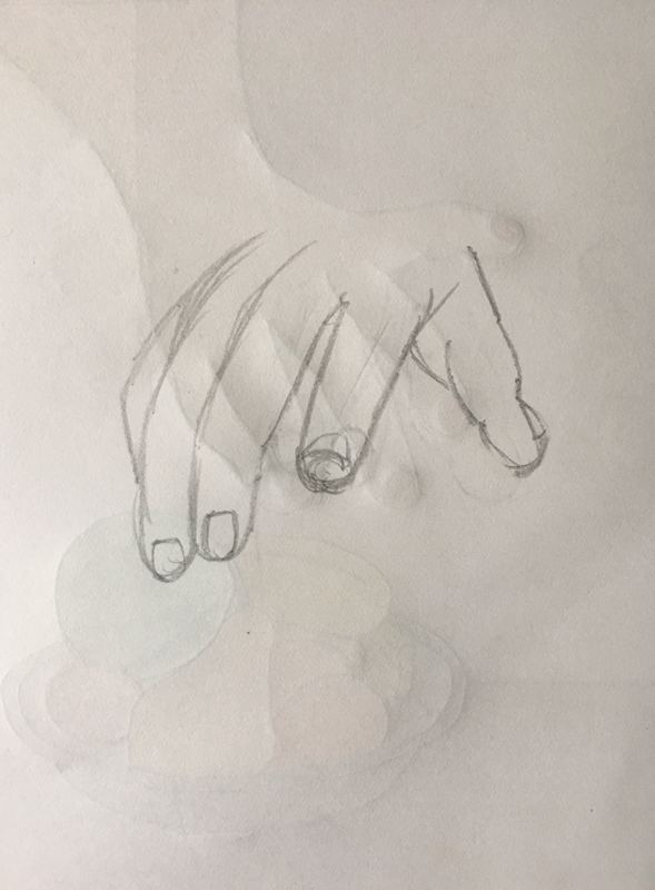
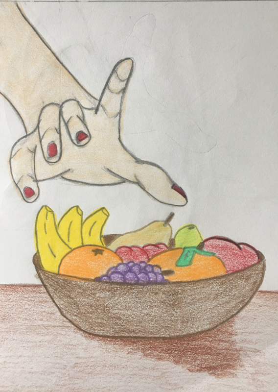
Before we started our project we had to choose two different ideas for our foreshortening drawing. We drew some sketches for our two options to see which one would look the best. After I finished I decided to to my second option which was the hand reaching to the fruit bowl. I choose this option because I really wanted to color the fruit and I thought it would show foreshortening the best with the hand.
Final: (In Progress)
1. Describe how you created an interesting point of view? Was it successful? Why or why not?
Answer:
I created an interesting point of view, because I made the hand look like its coming at you and I tried to make the fruit bowl look like it's below the hand. The composition is interesting, you can see how the things closer to the front look larger while the things in the background look smaller. I think It was successful because it makes my drawing look more realistic.
2. Why is it important to understand perspective and how to draw it?
Answer:
Perspective is important to understand, because an interesting point of view can create a more successful piece. It also helps your drawing to not look flat and to look more realistic. I think it's a great tool to analyze other things like colors, and learning to exaggerate things to emphasize the focal points of a piece.
3. How were the colored pencil exercises important in the success of your piece?
Answer:
The colored pencil exercises were really important to the success of my piece. Since I had never worked with prismacolors I was able to get a better understanding for how to layer the colors and blend them together. The exercises also helped me know how to create the shadows and highlights on my drawing.
4. Describe the craftsmanship of your colored pencil. What techniques were used? (How well the project is technically crafted).
Answer:
I believe my craftsmanship was very successful. I used a lot of pigment, creating a smooth texture and a good blending of colors. I used a good amount of shadows and highlights, indicating a light source. I learned to always start with the lighter color and to build it up from there rather than using dark colors at first because them it's harder to fix.
5. Were you able to achieve depth by showing a foreground, middleground and background? Explain.
Answer:
I was able to create the foreground, middleground, and the background well. Notice the fingers in the hand look larger because they are the ones in the front and they are coming towards you. As you move back, the things become smaller and smaller in size. This is accurate and creates the illusion of the perspective through foreshortening.
6. Explain your experience with colored pencil and the project in general. What were the obstacles and advantages?
Answer:
I had never used prismacolors before actually doing this foreshortening project. But after doing this project, I really liked using them and I liked how my drawing turned out. Hopefully as time goes on I will get better and better at using them. The hardest part for me, was layering because I didn't liked how time consuming some of it was. I did, however, liked the blending of the colors and how smooth it was. I also liked the level of control I had over them, and how pigmented it is.
7. Looking back on the progression of this project what skills, techniques or other information would you like to have been taught? Do you feel you were prepared for this project?
Answer:
I think I was prepared for this project. Since we did the practices in prismacolors I understood how to use them and blend them together. I think my teacher did a good job teaching us prismacolor techniques. However, it might have been a good idea to learn some techniques for texture to add to our drawings.
Answer:
I created an interesting point of view, because I made the hand look like its coming at you and I tried to make the fruit bowl look like it's below the hand. The composition is interesting, you can see how the things closer to the front look larger while the things in the background look smaller. I think It was successful because it makes my drawing look more realistic.
2. Why is it important to understand perspective and how to draw it?
Answer:
Perspective is important to understand, because an interesting point of view can create a more successful piece. It also helps your drawing to not look flat and to look more realistic. I think it's a great tool to analyze other things like colors, and learning to exaggerate things to emphasize the focal points of a piece.
3. How were the colored pencil exercises important in the success of your piece?
Answer:
The colored pencil exercises were really important to the success of my piece. Since I had never worked with prismacolors I was able to get a better understanding for how to layer the colors and blend them together. The exercises also helped me know how to create the shadows and highlights on my drawing.
4. Describe the craftsmanship of your colored pencil. What techniques were used? (How well the project is technically crafted).
Answer:
I believe my craftsmanship was very successful. I used a lot of pigment, creating a smooth texture and a good blending of colors. I used a good amount of shadows and highlights, indicating a light source. I learned to always start with the lighter color and to build it up from there rather than using dark colors at first because them it's harder to fix.
5. Were you able to achieve depth by showing a foreground, middleground and background? Explain.
Answer:
I was able to create the foreground, middleground, and the background well. Notice the fingers in the hand look larger because they are the ones in the front and they are coming towards you. As you move back, the things become smaller and smaller in size. This is accurate and creates the illusion of the perspective through foreshortening.
6. Explain your experience with colored pencil and the project in general. What were the obstacles and advantages?
Answer:
I had never used prismacolors before actually doing this foreshortening project. But after doing this project, I really liked using them and I liked how my drawing turned out. Hopefully as time goes on I will get better and better at using them. The hardest part for me, was layering because I didn't liked how time consuming some of it was. I did, however, liked the blending of the colors and how smooth it was. I also liked the level of control I had over them, and how pigmented it is.
7. Looking back on the progression of this project what skills, techniques or other information would you like to have been taught? Do you feel you were prepared for this project?
Answer:
I think I was prepared for this project. Since we did the practices in prismacolors I understood how to use them and blend them together. I think my teacher did a good job teaching us prismacolor techniques. However, it might have been a good idea to learn some techniques for texture to add to our drawings.
Candy Drawing
These pictures show my progress in drawing candies with pastel pencils and chalk. This drawing helped me practiced how to draw plastic and how to make things look transparent. I used different colors to build up the value and used white to hightlight the areas the light reflected the most.
Opacity Project
1. Describe the craftsmanship of your drawing. (Is it neat and well executed?)
Answer:
I think the overall craftsmanship of my drawing is very neat and precise. I was really careful in drawing the different items in my piece I made sure they were the correct size and shape. I spent a lot of time adding all of the highlights in my drawing and finding the exact place of where everything was located. I also think I did a really good job drawing the bread bag it looks really realistic.
2. Describe how your background choices help unify the three artworks and tie them together as one piece of art.
Answer:
?
3. Describe your choice of colors/color harmonies and how you used them throughout the artwork.
Answer:
In my opacity project I incorporated many different colors in the cereal bowl, I used lighter colors where the light reflected and darker colors where the shadows were. In the cinnamon bun I also used a variety of browns, I used darker browns in the creases but lighter browns in the middle. The use of different colors created a focal point in my piece which draws the attention of the eye.
4. How did you create contrast in your drawing?
Answer:
I created contrast in my drawing by doing the background as wood because in my actual picture the background was a white table. I decided not to copy the picture because if I did it would be really hard to tell which where the highlights and the drawing would be overpowered with white. The wood contrast in the background makes the highlights be the central point in my piece.
5. How did you use textures, highlights and shadows to enhance your artwork?
Answer:
The texture in my drawing was smooth, I did this by layering my prismacolors on top of each other. In the cinnamon bun I added highlights on top and around to show the plastic bag it was in and I added shadows on the bottom of the bun and in the creases of the bread where it meet together. For the cereal bowl I added highlights around the bowl to demonstrate how the bowl was glass and in the bread bag I added highlights in all of the folds in the plastic bag. I added black and gray underneath the items to make them pop out more and to show their shadows.
6. Why did you choose a particular background color to mount your artwork?
Answer:
As I already mention the background in my piece is not the same one as the background in my photo. It was really hard for me to decide what to do but I ended up doing wood because I thought it would help my highlights pop out more and be the main focal point. I am glad I decided to do this because I think it looks great and if I would of done white the highlights would of blended with the background.
7. Discuss the importance of understanding the media (prisma or pastels) and acquiring the skills necessary to create a successful project.
Answer:
It was really important to understand the prisma medium and the skills to create a successful and beautiful final project. In my drawing I used prismacolors and it took me a lot of practice to understand how to blend the colors together and knowing which colors to combine. Before creating this project I used pastel pencils which I learned how they worked, they were really easy to blend but it was really hard to add small details. That's why I decided to use primacolors for my opacity project, so I could be able to add the label in the bread and all the small details. It really important to know how all mediums work because it helps you determine which one would be the best to use.
8. Describe any difficulties you had creating your drawing and what you could do to improve your drawing?
Answer:
Some difficulties I had while creating my drawing were creating the shadows and creating the wood background. I decided to use brown and gray for the shadows and for the background I first drew some lines to add some wood details and then use many different shades of brown to color it in. To improve my drawing I would add more shadows and add highlights on the wood to make it look more realistic and detailed.
Answer:
I think the overall craftsmanship of my drawing is very neat and precise. I was really careful in drawing the different items in my piece I made sure they were the correct size and shape. I spent a lot of time adding all of the highlights in my drawing and finding the exact place of where everything was located. I also think I did a really good job drawing the bread bag it looks really realistic.
2. Describe how your background choices help unify the three artworks and tie them together as one piece of art.
Answer:
?
3. Describe your choice of colors/color harmonies and how you used them throughout the artwork.
Answer:
In my opacity project I incorporated many different colors in the cereal bowl, I used lighter colors where the light reflected and darker colors where the shadows were. In the cinnamon bun I also used a variety of browns, I used darker browns in the creases but lighter browns in the middle. The use of different colors created a focal point in my piece which draws the attention of the eye.
4. How did you create contrast in your drawing?
Answer:
I created contrast in my drawing by doing the background as wood because in my actual picture the background was a white table. I decided not to copy the picture because if I did it would be really hard to tell which where the highlights and the drawing would be overpowered with white. The wood contrast in the background makes the highlights be the central point in my piece.
5. How did you use textures, highlights and shadows to enhance your artwork?
Answer:
The texture in my drawing was smooth, I did this by layering my prismacolors on top of each other. In the cinnamon bun I added highlights on top and around to show the plastic bag it was in and I added shadows on the bottom of the bun and in the creases of the bread where it meet together. For the cereal bowl I added highlights around the bowl to demonstrate how the bowl was glass and in the bread bag I added highlights in all of the folds in the plastic bag. I added black and gray underneath the items to make them pop out more and to show their shadows.
6. Why did you choose a particular background color to mount your artwork?
Answer:
As I already mention the background in my piece is not the same one as the background in my photo. It was really hard for me to decide what to do but I ended up doing wood because I thought it would help my highlights pop out more and be the main focal point. I am glad I decided to do this because I think it looks great and if I would of done white the highlights would of blended with the background.
7. Discuss the importance of understanding the media (prisma or pastels) and acquiring the skills necessary to create a successful project.
Answer:
It was really important to understand the prisma medium and the skills to create a successful and beautiful final project. In my drawing I used prismacolors and it took me a lot of practice to understand how to blend the colors together and knowing which colors to combine. Before creating this project I used pastel pencils which I learned how they worked, they were really easy to blend but it was really hard to add small details. That's why I decided to use primacolors for my opacity project, so I could be able to add the label in the bread and all the small details. It really important to know how all mediums work because it helps you determine which one would be the best to use.
8. Describe any difficulties you had creating your drawing and what you could do to improve your drawing?
Answer:
Some difficulties I had while creating my drawing were creating the shadows and creating the wood background. I decided to use brown and gray for the shadows and for the background I first drew some lines to add some wood details and then use many different shades of brown to color it in. To improve my drawing I would add more shadows and add highlights on the wood to make it look more realistic and detailed.
Eyes:
The first eye we drew it together with the whole class just as practice. Eye #1 was just a normal generic eye while Eye #2 was my own eye. The most difficult task for me was to draw the eyelashes because to be they looked fake and I wanted them to look realistic. The last picture I drew was both of my own eyes together at fist it was hard for me to draw the eye brows and knowing how far they where from each other. My favorite part of the face to draw are the eyes.
Noses:
Drawing noses is the hardest to draw out of all of the face features for me. At the beginning I had a really hard time drawing out the shape and knowing how to shade it well. As you can see through my progress I got better and better the more I tried. I learned that you should always shade with the shape of the nose and that sometimes you have to exaggerate to make it look more realistic.
Lips:
For this assignment, we first watched a tutorial video on how to make lips look realistic and we followed along. The first drawing was the practice drawing and the second is a drawing of my own lips. The last two drawing I did was from a different view and a funny one which I did duck lips. I really found the video really helpful because it gave me tips on how to add the value and make them look real.
Skull Drawing Practice
To practice drawing all of the facial features, Mrs. Rossi gave us a picture of a skull and placed a transparent paper on top to draw over it. I used the skull background to help me know where the features on the face where located and to try to measure the size of my head. I think this really helped in my final because I learned that your eye line is in the middle of the head and your hair takes part of the space of our forehead.
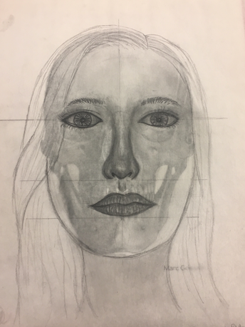
Self-Portrait
Self Evaluation:
1. Explain the process you went through to develop your drawing.
Answer:
To develop my drawing, the first thing I did was add all of the correct proportions and sketched out the facial features really lightly. Then, I started adding value to my eyes using the advice Mrs. Rossi gave us when we went over the shading techniques as a class. I continued to do the exact same thing with the nose and the mouth until they looked realistic. Then, I added value to my face and neck with a really light pencil and blended it out to make it look smooth. Lastly, I outlined my hair and added the darks and the lights depending on were the light source was reflecting upon and just drew the top section of my shirt on the bottom part of my drawing.
2. Explain how you found the different values in the portrait?
Answer:
I was able to find the different values in my portrait by looking really carefully at my picture and seeing where the shadows and highlights were located. Underneath my face on my neck and where my hair was overlapping I made sure to add shadows and add the highlights on my forehead, checks, and nose. A trick I also used was after I took my picture I made it black and white and that way I knew exactly where to add value.
3. Did you achieve a full range of the different values within your portrait? How?
Answer:
I think that I was able to use the majority of all of the different values within my portrait. I was able to create darker values on my neck, near my chin and where my hair overlapped each other. I also included the light values where the light source was hitting my face for example on my checks, forehead, and some parts of my hair. To make the darks I used a dark pencil or even used a black charcoal pencil and for the highlights I used a really light pencil like an HB and blended it out with a tissue to make it look smoother.
4. Describe your craftsmanship. Is the artwork executed and crafted neatly?
Answer:.
As I was drawing my self portrait I tried really hard to not put my hand down on my piece of paper because the graphite of my pencil would smudge all over my drawing. I feel like I did a good job making my lines crispy and neat on my eyes and mouth because they look really outlined and not blurry. The only place where I think I missed up was on my hair because it looks a little blurry and blended together. Next time I can out line out more of my lines and add more different values so it looks more realistic.
5. How were you able to capture your look?
Answer:
I was able to capture my look by taking my time and being really detailed on my facial features to make sure they looked like mine and realistic. Another big thing that took big part of my drawing was my hair because at first my face looked a little weird and it looked like I had a really big forehead. But then when I added the hair I realized the hair takes part of the forehead and it made my drawing look more like me. I feel like I made my eyes too big compared to my nose and mouth they should be a little smaller. The nose and mouth I think look the most like mine because my nose is rounded and my mouth is thin and medium size.
6. Explain how you made sure you had correct facial feature placement.
Answer:
I made sure I correctly placed my facial features because I used the measurements Mrs. Rossi taught us in class. The eyes are one of the most important features of the face because you use them to see exactly where everything will be located on the face. The average face has five eyes across from left to right using the outline of the size of your eye and from their you can used it to find where the nose, mouth, ears, eyebrows, and chin will be at.
7. Explain the importance of learning how to draw all the features individually.
Answer:
Learning how to draw all of the facial features individually is very important because it helps the artist understand the differences in the features that make the face unique. It also helps you know where to shade and add value to create the correct affect and make them look realistic. I really think that the practices of the eyes, nose, and mouth we did before starting the final project were really helpful and I learned a lot of tips/advice.
8. What part of this unit was the most beneficial and why?
Answer:
The part of this unit that was the most beneficial to me were the practices and the shading techniques on the facial features. I was able to learn exactly how to draw the facial features adding the correct values and I learned how to go back with the kneaded eraser to make the highlights. Since I had already practiced drawing the features it was easier for me drawing them on my final project.
9. List any obstacles you had to overcome and how you dealt with them.
Answer:
I really struggled on two different things on my drawing and both had to deal with the eyes. The first one was finding the correct eye shape and size since the eyes determine the correct placement of the facial features on the face. What I did to solve this problem was traced the shape of my eye on a small piece of transfer paper and see if it was either to small or to big or just the right size. The other obstacle I had was making my eyes look like my own because the eyes define the person and I did not want to mess it up. But I overcame this obstacle by practicing them first on a separate sheet of paper and adding all of the small details.
Scratchboard
Self Evaluation:
1. Describe the subject matter and meaning of your artwork.
Answer:
I decided to do a wolf looking at the moon in a forest because when I was on my trip in Mexico, one of my friends had a husky puppy and it looked just like a wolf which inspired me to draw it. Also because since the beginning when I was coming up with ideas I really wanted to draw tress in the background of my drawing. It is also implying movement by the fur on the wolf moving, the leaves on the trees or the grass, and the light/brightness coming from the moon.
2. How did you use textures to enhance your picture?
Answer:
I used textures to enhance my picture by making the fur on my wolf look like its moving and wavy not just straight lines. I also used texture on the tress my making curved lines based on the direction the tree was going to make them look rounded while compared to them being just flat. The moon also includes texture because I tried to use the cross hatching method to make it pop out and look more realistic/different.
3. How did you balance your artwork and create a well-organized composition?
Answer:
I balanced my artwork and created a well-organized composition by making the trees and the wolf go off the page. I also made sure to balance the amount of lights and darks not leaving too many white areas. I think the overall composition looks really good and interesting and I feel like the moon adds a compelling view. Overall I think everything on my drawling turned out fairly well and I really enjoyed the process of making it.
4. How did you imply movement in your drawing?
Answer:
I implied movement in my drawing by making the fur on the wolf look wavy and not just making straight lines because that would make it look still and flat. Movement is also implied on the grass in the background of my drawing and on the leaves on the tree branches. The waves on the moon also demonstrate movement and show how the light is being reflected towards the trees.
5. How could you improve your artwork?
Answer:
If I were able to redo or improve my artwork I would change the location of my moon because I accidentally drew the moon first and I needed my tree to be on the front instead of being in the back but it was too late to change it. I could also improve my drawing by making my trees on the background look more realistic and three dimensional.
6. How did you demonstrate a wide range of shading values?
Answer:
I demonstrated a wide range of shading values by using less lines in certain areas and in highlighted areas using more lines to make it look brighter. I also make sure to leave areas empty just plain black to give the illusion of shading. For example, I used really bright highlights towards the front of the trees and in the back it starts to get darker to show only where the light is being reflected on.
